Logo Redesign - Deakin Guitars
For the module 'Design for Digital Media', I redesigned the logo of an existing Leeds company called Deakin Guitars
Before

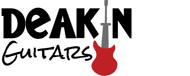
After
 "
"
Deakin Guitars is a company that has specialisesd in
repairing guitars and amps and selling both second-hand
and damaged guitars for over 25 years.
I have redesigned this logo with the intention of
maintaining it’s original red colour scheme, connoting the
rock music genre, whilst also reflecting the friendliness
and personality that comes from such independent
businesses through using a fun, informal font. I also
wanted to reflect the second-hand nature of the business,
so chose a messier, scrawly font to encompass this aspect.
I didn’t feel that the original logo communicated what the
company offered, so I added an image of a guitar body
with a screwdriver in place of the neck to reflect their
repair services. The logo was also not very scalable, so the
more readable fonts and vector format allows it to be used
in a wide variety of ways.
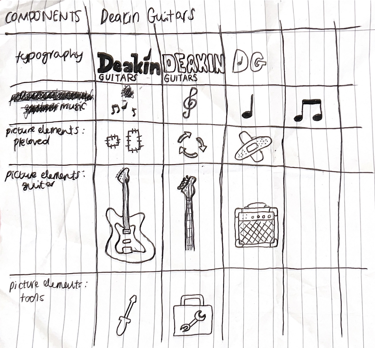
Morphological Matrix